

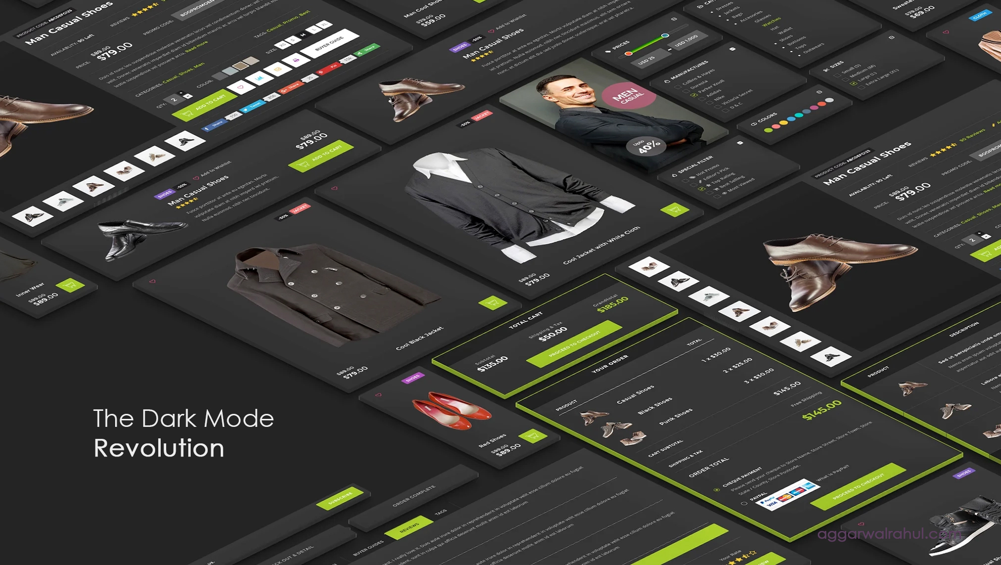
The Dark Mode Revolution: A Powerful Guide to Implementing Dark Themes
The moment you open your favorite social media app, your phone’s operating system, or even a professional code editor, you’ll likely see the option to switch to a dark theme. What was once a niche feature for developers has now exploded into a mainstream movement, and it’s completely reshaping how we design for the web. This isn’t just a fleeting trend; it’s a full-blown shift in user preference, and it’s what I call the Dark Mode Revolution.
Embracing dark mode is no longer a luxury—it’s a necessity. It’s a powerful way to enhance a website’s aesthetics, improve user comfort, and demonstrate that your brand is in tune with modern digital standards. In this comprehensive guide, we’ll dive into why this change is happening, what the benefits are, and, most importantly, provide a step-by-step process for implementing a dark theme on your own website.
The Rise of the Dark Mode Revolution: More Than Just a Trend
The appeal of dark mode is deeply rooted in how we interact with technology. As screens have become an increasingly central part of our lives, the constant glare of a light interface has led to a digital strain. Users are seeking relief, and dark themes provide a simple, elegant solution.
This shift has been driven by both major technology companies and the general public. Google, Apple, and social media giants have all integrated dark themes into their core products. The result is a consistent user expectation that websites should also offer a dark theme option. The Dark Mode Revolution is simply the design community responding to this demand.
By implementing a dark theme, you’re not just adding a cool aesthetic; you’re showing your users that you care about their digital wellbeing. You’re meeting them where they are and providing a more comfortable, personalized experience.
The Powerful Benefits of Embracing the Dark Mode Revolution
The move to dark mode is popular for a reason. It delivers a number of tangible benefits that can improve a website’s user experience (UX) and overall appeal.
Reduced Eye Strain and User Comfort
This is, by far, the most significant benefit of the Dark Mode Revolution. In low-light environments, a bright white screen can feel like a searchlight. The high contrast between the bright background and dark text can lead to eye fatigue and dryness. A dark theme, by reducing the amount of light emitted by the screen, makes content easier to read for extended periods. This is especially true for users who are browsing late at night or in a dimly lit room.
Improved Aesthetics and Modern Appeal
A dark theme can completely transform the look and feel of a website. It provides a sophisticated and modern aesthetic that immediately grabs attention. Against a dark background, colors and subtle design elements can pop and create a dramatic visual effect. A website with a dark theme feels sleek, contemporary, and often more professional. This aesthetic benefit is a key reason why the Dark Mode Revolution has been embraced by so many brands.
Energy Efficiency and Battery Life
For devices with OLED or AMOLED screens (like most modern smartphones and high-end laptops), a dark theme can significantly reduce power consumption. These screens work by illuminating individual pixels. When a pixel is black, it’s simply turned off, saving a significant amount of energy. This is a practical benefit that users can directly appreciate, as it helps extend their device’s battery life throughout the day.
Enhanced Accessibility
While dark mode is often seen as an aesthetic choice, it’s also an important accessibility feature. For users with conditions like light sensitivity or certain visual impairments, a dark theme can make a website more usable and less overwhelming. It gives the user control over their experience, which is a core principle of good web design. The Dark Mode Revolution is, in part, a win for digital accessibility.
A Step-by-Step Guide to Implementing the Dark Mode Revolution
Implementing a dark theme is a technical process, but it’s more straightforward than you might think. The modern approach relies on CSS custom properties, which make managing your light and dark color palettes incredibly simple.
Phase 1: The Design Strategy
Before you write a single line of code, you need a plan. You can’t just invert your colors. A well-designed dark theme requires its own carefully selected color palette.
- Choose a primary dark color: Don’t use pure black (#000000). A deep gray or a very dark blue is often easier on the eyes and feels more sophisticated.
- Establish your light colors: Use a slightly off-white instead of pure white for your text. This will reduce glare and prevent your text from looking too stark against the dark background.
- Design for contrast: Make sure your text and key elements have enough contrast to be readable. The Web Content Accessibility Guidelines (WCAG) recommend a contrast ratio of at least 4.5:1 for normal text.
Phase 2: The Core Implementation (CSS Variables)
This is the technical heart of the Dark Mode Revolution. We’ll use CSS custom properties to define our colors once and then switch them out based on a class. This approach is highly scalable and easy to maintain.
First, define your color variables in the :root pseudo-class for your default (light) theme:
:root {
–color-text: #2c3e50;
–color-background: #ffffff;
–color-primary: #3498db;
–color-secondary: #f39c12;
}
body {
background-color: var(–color-background);
color: var(–color-text);
}
Next, create a .dark-mode class that will override these variables when applied to your body or main container.
.dark-mode {
–color-text: #ecf0f1;
–color-background: #2c3e50;
–color-primary: #3498db;
–color-secondary: #f1c40f;
}
Now, all your CSS properties should use the variables. This is where the magic happens. A simple class toggle will switch your entire color scheme. For more on the power of CSS variables, check out this CSS-Tricks guide.
Phase 3: The User Toggle
Now, let’s give the user control. We’ll use a small piece of JavaScript to add a toggle button that switches between the light and dark themes.
<button id=”theme-toggle”>Toggle Dark Mode</button>
const themeToggle = document.getElementById(‘theme-toggle’);
const body = document.body;
themeToggle.addEventListener(‘click’, () => {
body.classList.toggle(‘dark-mode’);
});
To make the experience seamless, you should also save the user’s preference to localStorage so it persists across page reloads.
const themeToggle = document.getElementById(‘theme-toggle’);
const body = document.body;
// Check for saved theme preference on page load
const savedTheme = localStorage.getItem(‘theme’);
if (savedTheme) {
body.classList.add(savedTheme);
}
themeToggle.addEventListener(‘click’, () => {
if (body.classList.contains(‘dark-mode’)) {
body.classList.remove(‘dark-mode’);
localStorage.setItem(‘theme’, ”);
} else {
body.classList.add(‘dark-mode’);
localStorage.setItem(‘theme’, ‘dark-mode’);
}
});
Phase 4: Auto-Sensing the User’s System Preference
This is the final, essential step in a modern dark mode implementation. You should respect the user’s system-level preference by using the prefers-color-scheme media query.
@media (prefers-color-scheme: dark) {
body:not(.light-mode) {
–color-text: #ecf0f1;
–color-background: #2c3e50;
–color-primary: #3498db;
–color-secondary: #f1c40f;
}
}
This code tells the browser to apply the dark theme variables if the user’s system is set to dark mode. The :not(.light-mode) ensures that if the user manually selects the light theme, their choice will override the system preference.
Common Pitfalls and Best Practices for the Dark Mode Revolution
Implementing a dark theme isn’t just about changing your colors; it’s about re-thinking your design with a new palette. A few common mistakes can ruin the experience.

Licensed by Google
Avoiding Low Contrast
A common mistake is using shades of gray that are too similar, resulting in low contrast. This can make text and elements difficult to read. Always ensure your text has enough contrast against the background to be accessible.
Handling Images and Icons
Images can sometimes look out of place in a dark theme, especially if they have a bright, white background.
- PNGs with transparent backgrounds: Use these whenever possible.
- SVG Icons: SVGs are perfect for dark mode. You can easily change their fill color with CSS to match your dark theme palette.
- Image Overlays: For photos, consider adding a subtle overlay to desaturate them or tone down their brightness in a dark theme.
For example, a previous post discussed micro-interactions for WordPress. When applying a dark theme, a button that once had a light glow might need a new, subtle, dark-theme-friendly animation to maintain its magic.
Testing Thoroughly
Always test your dark theme on different devices, in different lighting conditions, and with different browsers. What looks great on your monitor might not translate well to a mobile screen. Ensure the experience is consistent and user-friendly everywhere.
Looking Ahead: The Future of the Dark Mode Revolution
The Dark Mode Revolution is here to stay, and its importance will only grow. As we spend more of our lives in front of screens, designers and developers will continue to prioritize user comfort and digital wellness. Giving users a choice in their browsing experience is a powerful way to build trust and brand loyalty.
While dark mode is a crucial step, it’s just one piece of the puzzle. The goal is to create a dynamic, adaptable, and user-centric website. This involves understanding your audience’s needs and creating a design that serves them, whether it’s through a beautiful dark theme or through the creative elementor experiments we’ve discussed before.
The true magic happens when human-centric design meets powerful implementation.
Ready to Elevate Your Website?
Are you ready to give your website a powerful aesthetic upgrade and improve your user experience? I specialize in creating unique, high-performance websites that incorporate the latest design trends and technologies.
Let’s discuss how we can bring your website to the next level.